Space Help In Your UI Design")

User Interface Design is a significant part of your mobile app or website. UI design is the point of interaction with the users. Most people are using smartphones these days. Hence, it is super apparent they will be using mobile apps too. With a massive rise in mobile app and website usage, it has become more crucial than ever to pay heed to a great user experience that also involves an incredible UI Design.
In 2018, mobile app downloads were 205.4 billion, which is projected to reach 258.2 billion in 2022. These figures are sufficient to tell us that mobile apps are the primary touchpoint for a vast audience, which makes designing your UI the best possible way. Considering that, app users are using more and more mobile apps due to their functionality and ability to do things quickly.
UI is the medium through which users interact with the mobile app. The UI includes all the buttons, app elements, controls, and more. The main focus of the UI is to render a simple, fun, and engaging experience between the app user and the app. The UI development process includes choosing a color, brand identity, and the newest design principles.
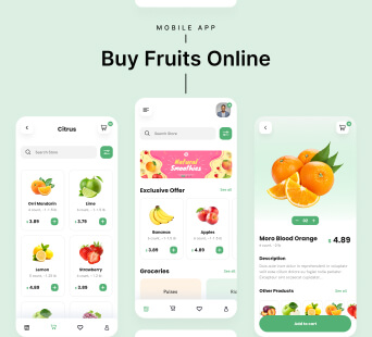
One of the UI design techniques, Whitespace, is one of the most ignored things that will be the most effective solutions for UI designers from app development companies and software development companies. White space can make your UI stand out while it can look like mere spaces, but it plays a significant role in making your design look WOW!
Let's learn in detail about white space in UI design and how it can help your UI design look stunning!
Topics to cover
- Introduction to White Space in UI Design
- Types of White Space
- Advantages of using White Space in UI
- The Bottom Line
Introduction To White Space In UI Design
White space is a handy technique while designing layouts. It's crucial to put together a design layout that allows your elements to breathe. This can be done by 'White Space.' White space is nothing but blank space between words, layouts, multiple design elements (images, icons, illustrations, typography, etc.).
White space doesn't have to be white. It can be of any color, hence also known as negative space. This isn't a complex technique to learn. All you must do is make space around each element, whether images, text, graphics or whatever. You must ensure you are leaving adequate space around each element to highlight their own importance. By doing so, you let the viewer understand what you are trying to convey.
Types Of White Space
In creating UI for mobile apps & websites, the use of negative space is critical for good usability and interface ability. There are 2 types of white spaces:
Micro-space refers to tiny gaps between the elements, such as spacing between the pictures, text, and more.
Macro Space refers to spaces between the primary components of a mobile app or web page and spacing around each element.
Advantages Of Using White Space In UI
White space creates balance as it leaves room between elements and content and highlights essential aspects. It eliminates distraction for the user as it gives enough air for the elements to breathe, and users are not overwhelmed with information that can allow them to look for what they need.
1. Improves Understanding
White spaces can make the content easily scannable and improve readability significantly. The ideal use of whitespace between paragraph lines can improve the understanding level up to 20% as per studies.
2. Enhances The Visual Hierarchy

The vacant spaces help users divide the content into easily readable pieces and focus on the details. This gives readers time to process and understand the information and make it more fun.
3. Emphasis On The Main Elements
The more room around a design element, the more attention it calls. Negative spaces focus the user's attention on the search bar and brand logo. Hence, with the help of spaces, you can captivate more attention towards essential elements.
4. Enhances The Style Of The Page
White space can be a pillar for the app development company UI design and make the design look unique. Such unique designs are never forgotten by the users and differentiate your design from that of others.
5. Gives Elements Of Space To Breathe
Elements, when cluttered, do not get adequate air to breathe; this can lead to a high distraction level for the user. Balance is the key! Allow white space to give enough room for your content to be readable and enhance user experience.
6. Increases The Engagement Levels

The average attention span is 6 - 20 seconds, as per sources. Good use of white space benefits the UI design as it gets the message via users quickly and lifts the possibility of engagement. The use of white space is pretty evident on Google's Search Engine.
7. Involves Sophistication
White space becomes the core design element used for setting a particular mood. White space gives rise to sophistication, as ample graphic elements can make the whole design look shabby.
The Bottom Line
Creativity using the white space is a skill that your UI designs must embrace to make your page look sophisticated and classy. Efficient use of white space can, in turn, boost your user engagement and retention, driving more traffic to your mobile app or website.
White space creates the right balance, harmony and helps your brand look more presentable. The main goal is to make the website or mobile app look more transparent and straightforward and provide details that your users will enjoy.
However, white space is an art; it needs practice. Since understanding how much space should be used to design a good layout needs training. Therefore, good luck with your experimenting!