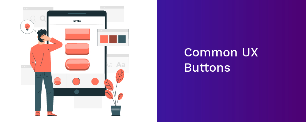
Buttons are an essential element that creates a productive & positive user experience. UX buttons are commonly styled links to entice users and drive them in a particular direction. Through buttons, we can connect to other pages or complete tasks like a form submission. At times, we use them as Call to Action (CTAs) when we need our users to complete their actions on our site. If you are considering improving your button design to make it easier for your user to click through, look at this guide to practice the most common UX buttons and best design practices.
What Is A Button?
Being an interactive & engaging element, a button enables getting interactive feedback that is expected from the system following a particular command. It's a control that allows users to interact directly with a digital product & sends crucial commands for achieving a particular objective.
The latest UX buttons are famous due to their effective imitated interaction with user-friendliness & physical objects. These buttons have different functions to match various purposes. They display an interactive zone that is usually marked out for having a particular geometric shape & visibility. Designers must use significant time & effort for designing effective & noticeable buttons.
Common UX Buttons
Drop-down Button
When clicking the drop-down button, it displays a drop-down list of exclusive products. At times, you can see the same type in the settings button. If a user picks an option in the list, it is usually labeled as active, for example, by color.
Text Button
These buttons are text labels that happen out of a text block. The text should explain the action that will occur if a user taps or clicks a button. These buttons include a low-level of stress, and app users use them for less important actions.
Hamburger Button
This button conceals the hamburger menu. So the menu extends by clicking on it. It's an extensively used interactive element of mobile and web layouts nowadays. Also, hamburger menus free the space making the UI more airy & minimalist. It saves plenty of room for other important layout elements.
Toggle Button
This button allows users to change the settings between two or more states. The toggle button can be used as the ON/OFF button. You can also use them to group associated options. There should be a minimum 3 toggle buttons in a group. Also, toggle buttons require label buttons with text, icons, or both.
Floating Action Button
This is a part of Google Material Design. This is a circular material button that displays and lifts an ink reaction if you click it. You can utilize this button for a promoted action.
Call To Action Button
A CTA button is another interactive element of the UI, and it aims to encourage users to take a specific action. And this specific action displays a conversation for a specific screen/page. In short, it turns a passive user into an active one. Technically a CTA button can be any type that is supported using a CTA text.
Ghost Button
These are also referred to as outlined buttons and boost the emphasis & complexity from the text button in button design. They indicate important actions which aren't the primary action on a page.
Share Button
Share button simplifies the process of connecting an app content or a website to the user's social profiles. Share button lets users share their accomplishments or content on social media. These icons highlight a brand sign of particular social platforms that is recognizable easily.
Plus Button
Plus button lets users add unique content to the system. Depending on the app type, it can be a post, note, new contact, location, and product in the list. Users are moved straight to the modal window of generating content after clicking a plus button.
Flat Button
This button doesn't lift but fills with several colors by pressing it. The main advantage of this button is that they prevent distraction from the content.
Play Button
This button uses an attractive hover effect. Once users move over or across this framer button, the whole button springs out with a fantastic 3D Gradient design. Suppose users move their mouse cursor away; the effect will totally append. You can include various hover & interaction effects for optimizing button designs in your app or web design.
Factors To Consider While Designing UX Buttons
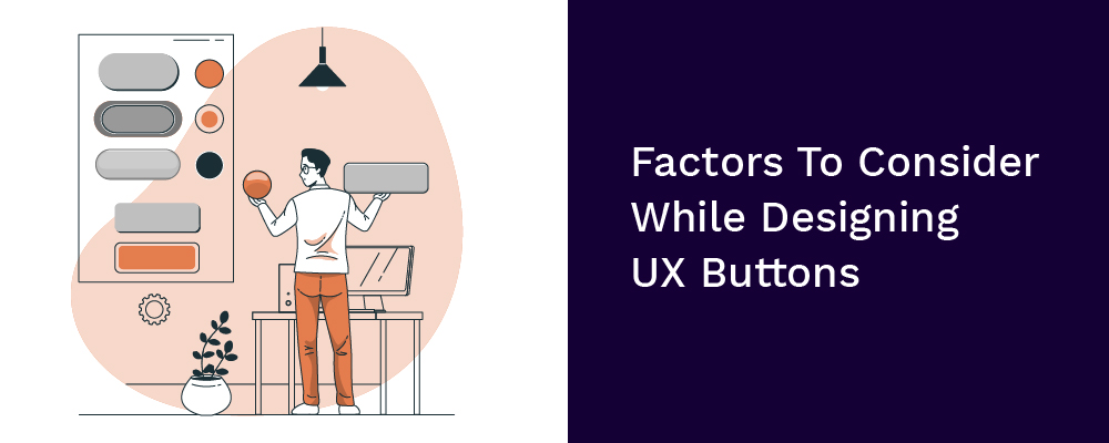
UI/UX designers should focus on button designs for creating unique buttons. They should evaluate and share ways, principles, and secrets by reading several articles and organize the shape, position, size, color, and more factors. Let's look at the factors to consider while designing UX buttons:
Size
This is one of the top practices to inform users about the layout element's necessity and create a hierarchy of components. An attractive & effective button should be adequate to be found instantly but not very big that the layout structure gets ruined. At times, market leaders give recommendations on the accurate button sizes in their instructions.
Color
You should choose a perfect color to make some buttons easily identifiable. Human behavior & mood are super related to the visual surroundings & color is one reliable tool in this aspect.
Placement
While placing a UX button, try using a standard UI pattern & conventional layouts as much as possible as conventional button placements improve discoverability.
Shape
If you are worried about button shapes, make square-shaped button designs, or make squares with round corners, depending on the website or app style. The research suggested that rounded corners enhance data processing and the center of the element captivates your attention.
Microcopy
This button is usually consistent but small to grab the user's attention quickly. At times, it is performed in Caps to make the copy more attractive in the layout.
Final Words
Buttons are a great way of guiding users to take actions you want them to take. These buttons will arise and become more interactive in the future. Therefore, plan them considering the factors discussed above. Make them more flashy, helpful, & intuitive, so they can easily engage with your app.
